Mobile devices are transforming the way people connect and communicate. From browsing the internet to streaming content online, you can do a lot of things on your smartphone.
According to Statista, the current number of smartphone users in the world today is 6.648 billion which is almost 83% of the world population.
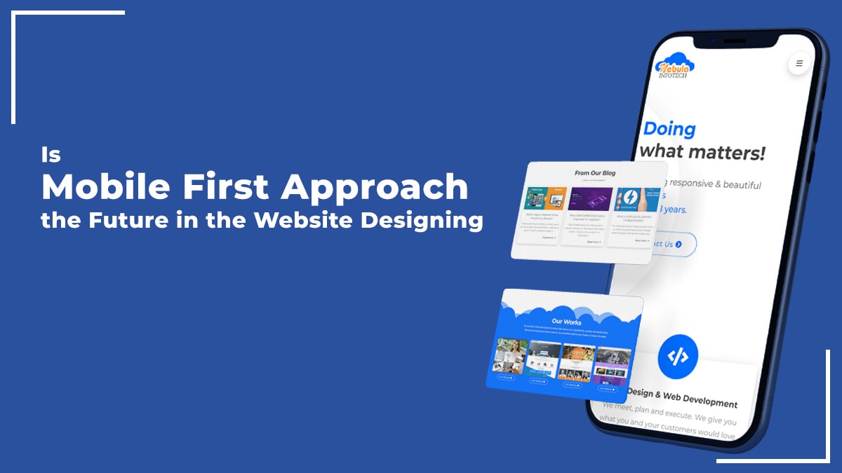
The world is going mobile-first faster than you can think, and you need to have your website designed for mobile as well.
Traditionally, developers used to build the website for desktop devices, and then they would scale down the website for the mobile devices.
With the mobile-first approach, you would design the website for the mobile devices, and then based on the design of the mobile website, the desktop website design would be further built.
This web designing approach has multiple benefits here is the list of benefits that you can find by going mobile-first with your web designing approach.
Google Indexes Mobile First
Google does not need any introduction has made Mobile-first indexing as a default for ranking websites. It essentially means, your website will be preferred for ranking in the Google SERPs.
The web has evolved from being a desktop-dominated space to more mobile-dominated which has been aided by Google only. Hence, if you want to be relevant in these changing times, then you have to evolve and accept the mobile-first approach.
Improve your Conversion Rate
Conversion rate is a very important metric that every website owner must look into. Conversion rate means the percentage of people who becomes your customer after visiting your website.
Since the medium of access for multiple websites has been shifting to mobile, the conversion rate of mobile users is also increasing rapidly.
As a developer, you need to keep your web design better in regards to the mobile device like for example- All the CTA buttons in your website must be optimized according to the user’s habit.
Around 80% of the users use their thumb to interact with the element while using mobile devices, therefore, you are required to develop the website ensuring the buttons are accessible to both thumbs.
Everyone has a Mobile Device
If you look around you would notice that everyone around you is holding a mobile device. There are over 6 billion mobile users in the world that are a lot of people with a smartphone and it is a sensible thing to have your website as a mobile-first design
Data Shows Mobile is the Future
Around 55% of internet users use a mobile device to access the internet. It’s a mind-boggling fact which proves the fact that Mobile is the future.
With increasing innovation in mobile devices, you could see the enhancing capabilities and performance with the mobile devices.
This innovation and improvement not only fuels more towards the adoption of mobile devices but also drives the web development space to go mobile-first.
Enhances User Experience
A mobile device is something that everyone carries with themselves, you can find the mobile device in your pocket or your hands.
Since it is so readily available, you can easily use the device without having had to switch it on and wait up until it gets booted up.
This improves the user experience which further influences a developer to go mobile-first approach with the website development.
Conclusion
Mobile-first is certainly a way to go, but that does not mean you should not focus on desktops. The best strategy for developing your website is to have a comprehensive approach with your website design and built it based on the mobile-first approach and further develop the website for the desktop.
I am Sunil Tarwara, a seasoned IT professional with over 13 years of hands-on experience in Website Development and Digital Marketing. With a deep understanding of the challenges faced by businesses, I have been trusted by hundreds of clients to achieve their digital goals. I have Master’s degree in Information Technology.
Apart from websites, I like hill stations.